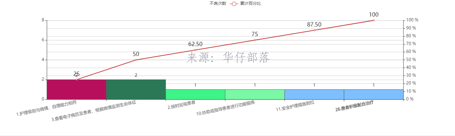
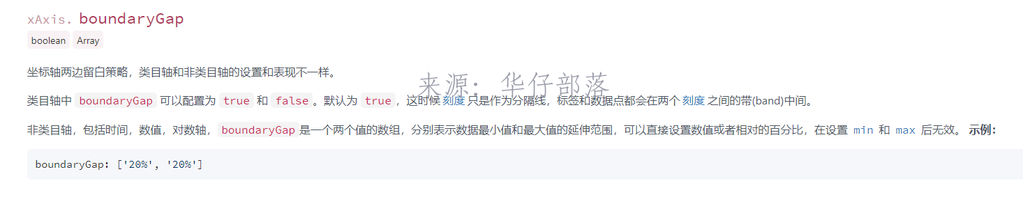
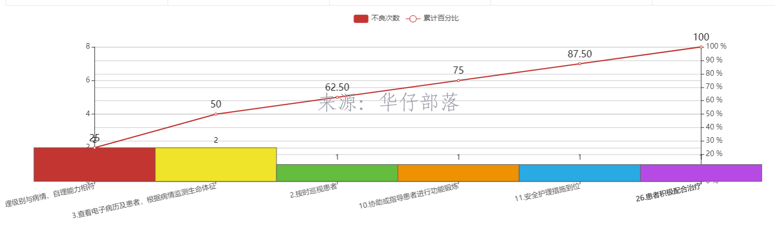
最近使用echarts绘制了这样一幅柱状图+折线图,但是不满足客户需求,他们希望折线图是从坐标轴原点开始,最右侧结束,柱状图保持不变。经查证,xAxis的boundaryGap属性设置为false可以满足要求。
设置属性对比如下:
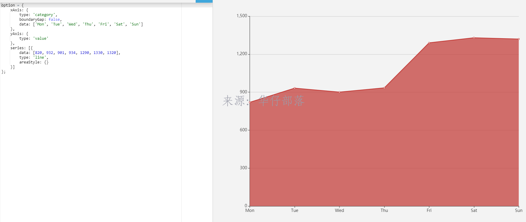
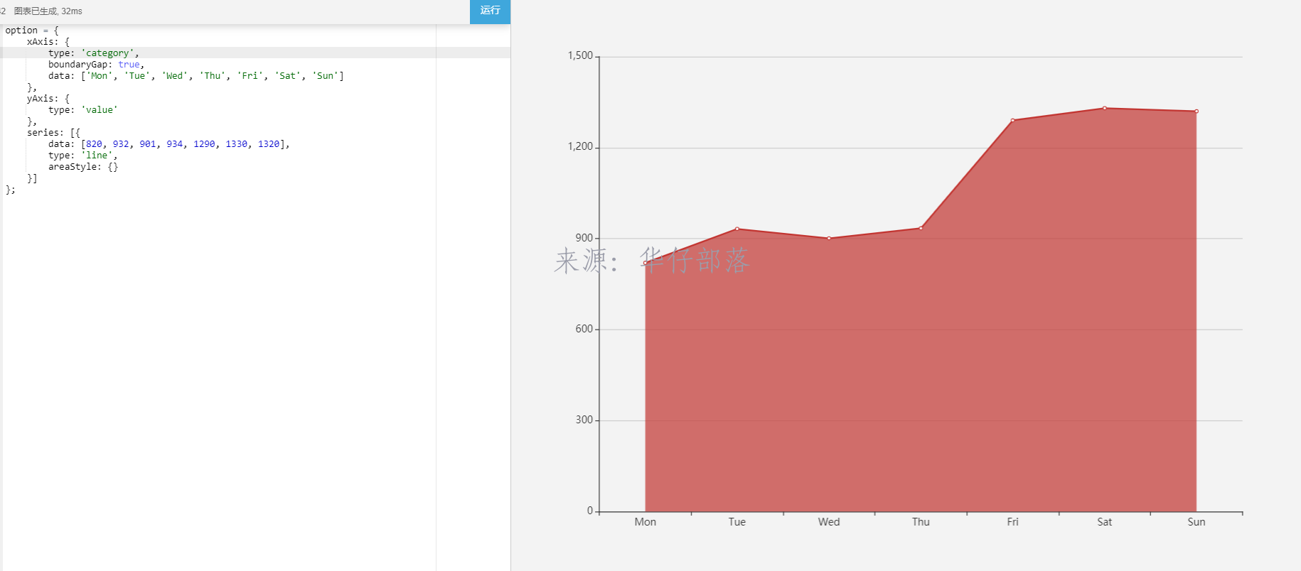
代码添加该属性后,柱状图也跟着变化了
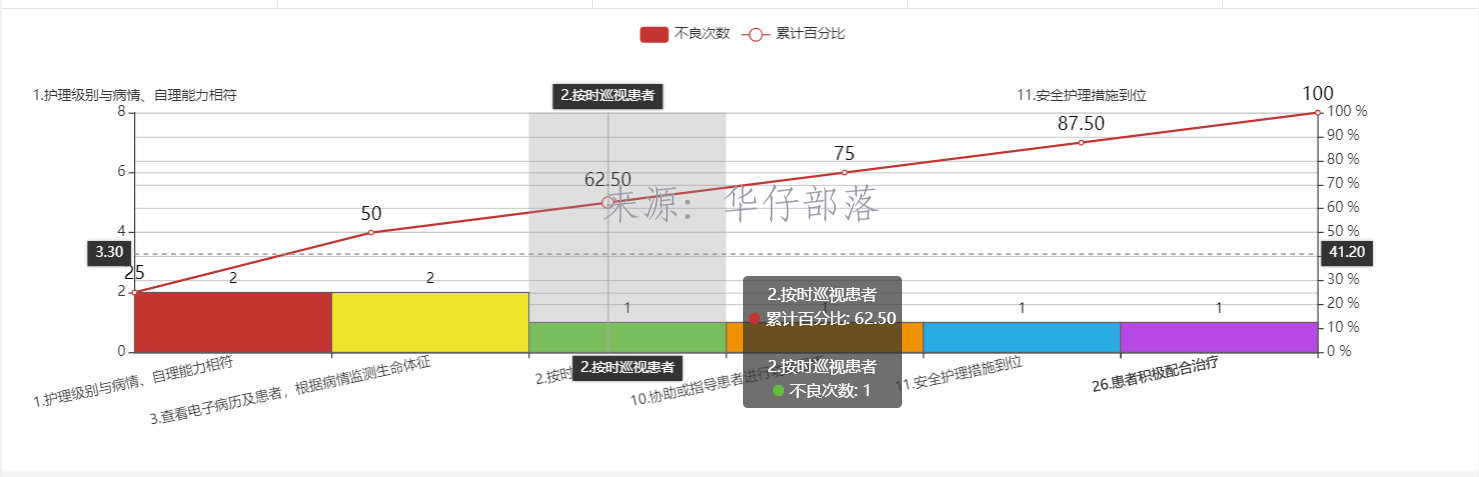
经常尝试,使用一个x轴是无法满足条件,故此增加了一个x轴,效果如下:
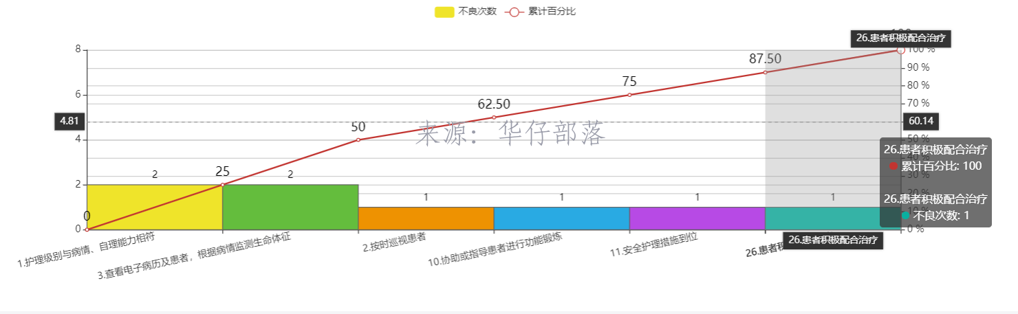
而此时还并没有满足要求,需求是要从0开始,所以针对新加的x轴和对应的y轴数据,都进行了补0操作,最终效果如下
具体代码:
// 获取图例数据
var legend=[];
if(undoneCountMap.legend){
legend=undoneCountMap.legend;
}
// 获取数据集合
var seriesData=undoneCountMap.seriesData;
// 获取x轴坐标
var xAxiasdata=undoneCountMap.xAxiasdata;
var series=[];
if(legend){
for(var jj=0;jj<legend.length;jj++){
if(jj==0){
var seriesObj={};
seriesObj.name=legend[jj];
seriesObj.type="bar";
if(seriesData.length>jj){
seriesObj.data=seriesData[jj]
}
seriesObj.barCategoryGap="0%";
var itemStyle = { //上方显示数值
normal: {
borderColor:'#5F5F5F',//边框颜色
//color:function(d){return "#"+Math.floor(Math.random()*(256*256*256-1)).toString(16);},
// 定制显示(按顺序)
color: function(params) {
var colorList = ['#EFE42A','#64BD3D','#EE9201','#29AAE3', '#B74AE5','#0AAF9F','#E89589','#16A085','#4A235A','#C39BD3 ','#F9E79F','#BA4A00','#ECF0F1','#616A6B','#EAF2F8','#4A235A','#3498DB','#C33531' ];
return colorList[params.dataIndex]
},
label: {
show: true, //开启显示
position: 'top', //在上方显示
textStyle: { //数值样式
color: 'black',
fontSize: 12
}
}
}
}
seriesObj.itemStyle=itemStyle;
series.push(seriesObj);
}else{
var itemStyle = { //上方显示数值
normal: {
label: {
show: true, //开启显示
position: 'top', //在上方显示
textStyle: { //数值样式
color: 'black',
fontSize: 16
}
}
}
}
var seriesObj={};
seriesObj.name=legend[jj];
seriesObj.type="line";
seriesObj.yAxisIndex=1;
seriesObj.xAxisIndex=1;
if(seriesData.length>jj){
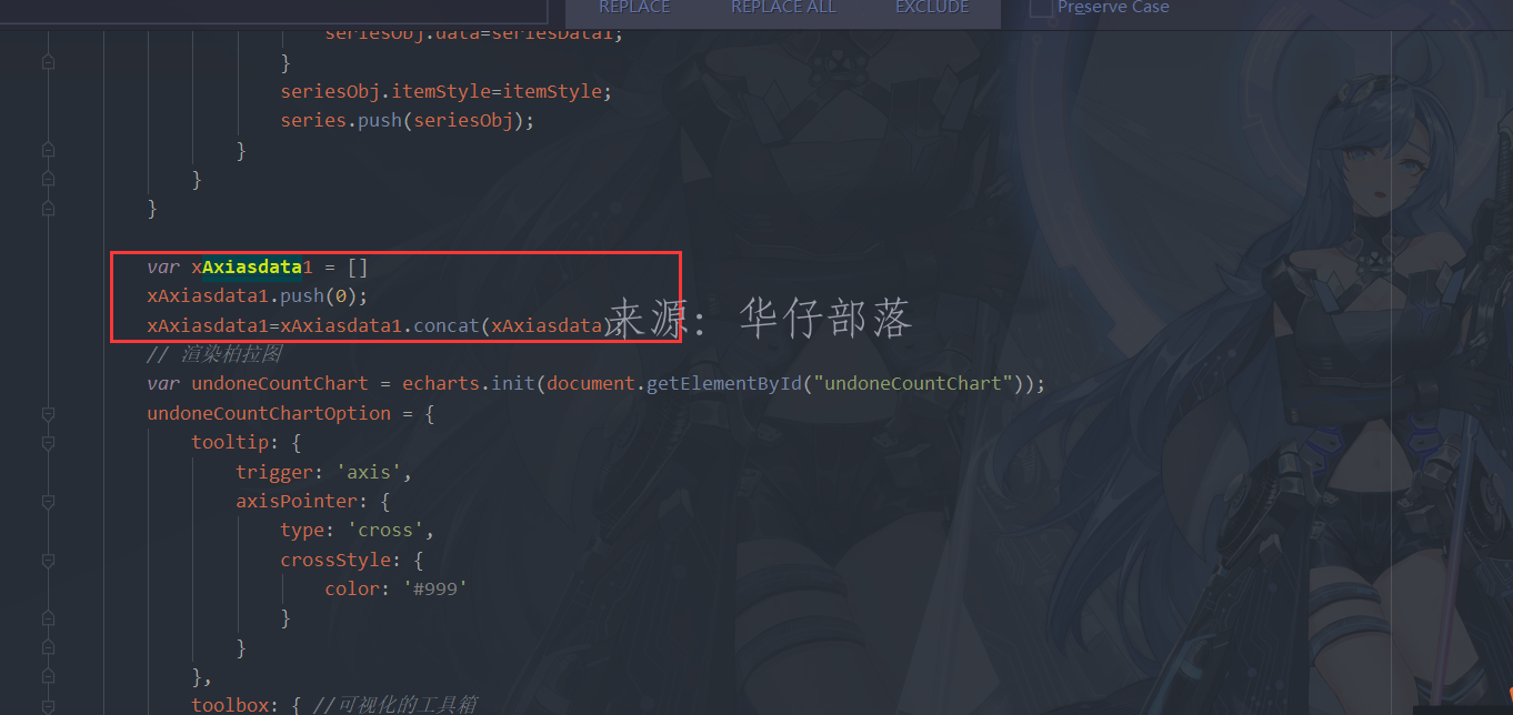
var seriesData1=[]
seriesData1.push(0);
seriesData1=seriesData1.concat(seriesData[jj]);
seriesObj.data=seriesData1;
}
seriesObj.itemStyle=itemStyle;
series.push(seriesObj);
}
}
}
var xAxiasdata1 = []
xAxiasdata1.push(0);
xAxiasdata1=xAxiasdata1.concat(xAxiasdata);
// 渲染柏拉图
var undoneCountChart = echarts.init(document.getElementById("undoneCountChart"));
undoneCountChartOption = {
tooltip: {
trigger: 'axis',
axisPointer: {
type: 'cross',
crossStyle: {
color: '#999'
}
}
},
toolbox: { //可视化的工具箱
show: true,
feature: {
saveAsImage: {//保存图片
show: true
}
}
},
grid:{
left:'10%',
bottom:'10%',
containLabel:true
},
legend: {
data: legend
},
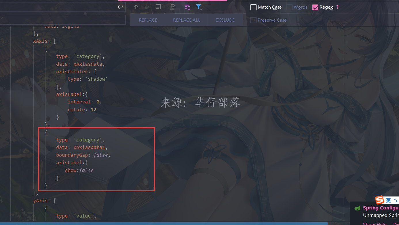
xAxis: [
{
type: 'category',
data: xAxiasdata,
axisPointer: {
type: 'shadow'
},
axisLabel:{
interval: 0,
rotate: 12
}
},
{
type: 'category',
data: xAxiasdata1,
boundaryGap: false,
axisLabel:{
show:false
}
}
],
yAxis: [
{
type: 'value',
min: 0,
max: undoneCountTotal,
//interval: 5,
axisLabel: {
formatter: '{value}'
}
},
{
type: 'value',
min: 0,
max: 100,
interval: 10,
axisLabel: {
formatter: '{value} %'
}
}
],
series: series
};
undoneCountChart.clear();
undoneCountChart.setOption(undoneCountChartOption);重点修改部分解析:
1、系列数据对应x轴下标;系列数据前面填充0;
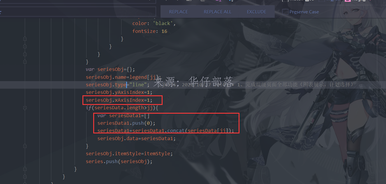
2、新增x轴数据,并且填充0
3、设置x轴数据,设置boundaryGap属性为false

")


还没有评论,来说两句吧...